Matt lacquer concept
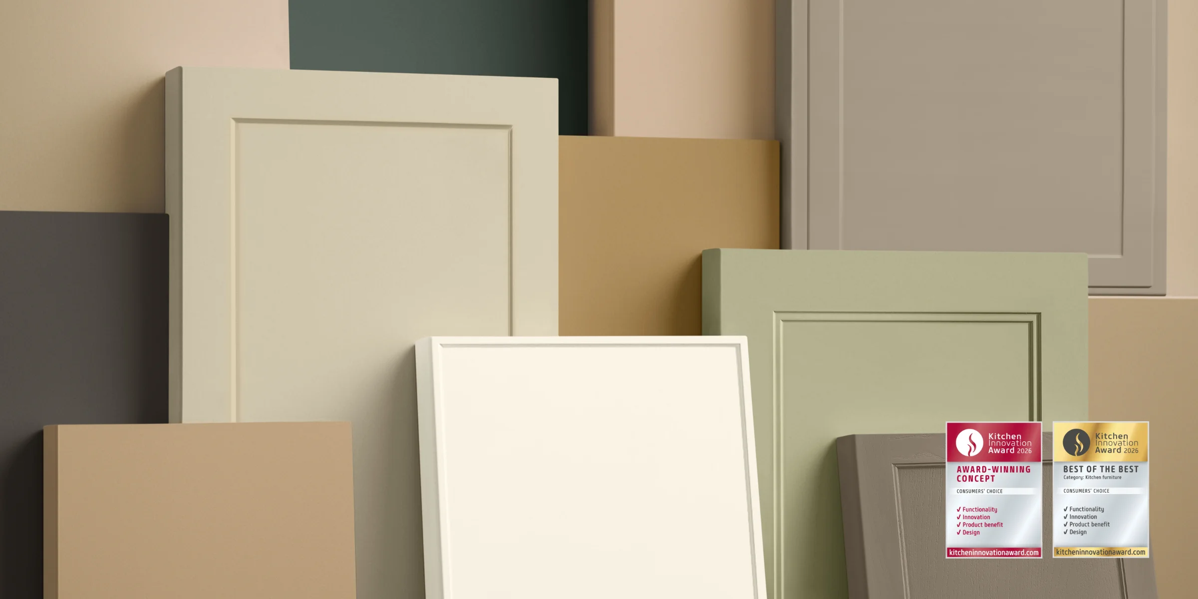
The proven matt lacquer concept from Nolte Küchen is more versatile than ever. New colors, materials and details open up fresh design options for modern kitchens. A support thickness of 22 mm ensures stability and durability for the frame fronts.
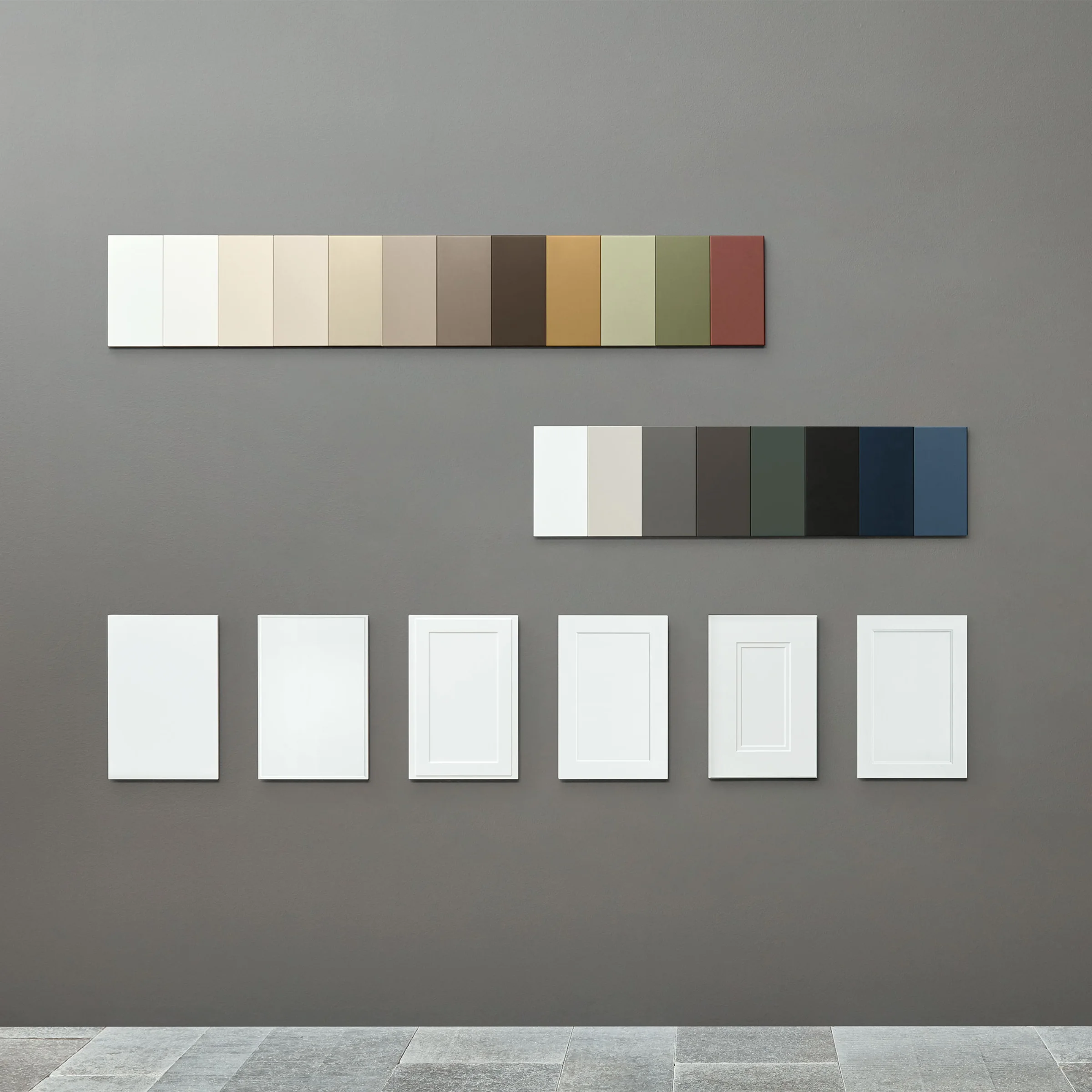
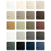
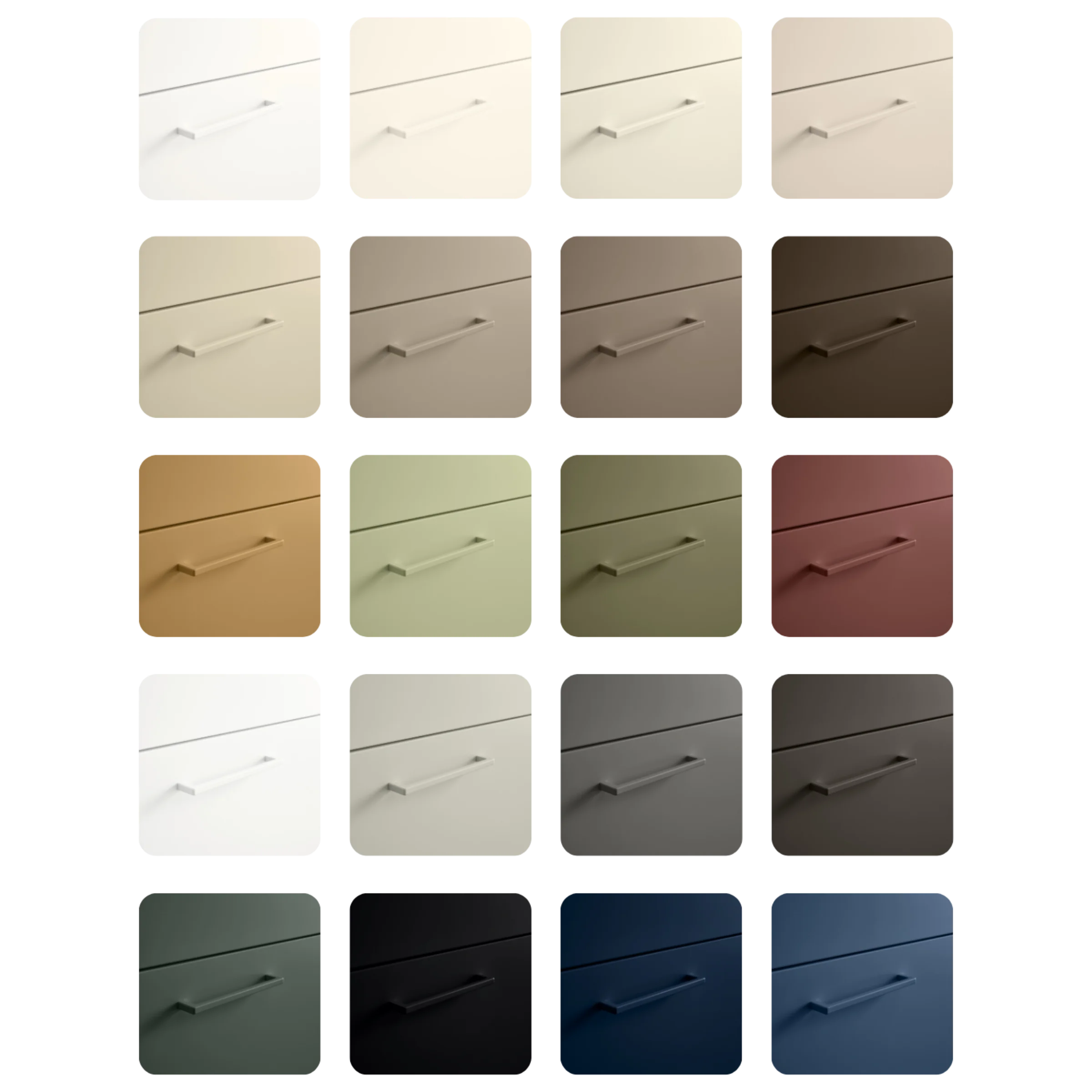
In addition to the 18 matt lacquer colors to date, Greige and Cashmere are two new nuances that pick up on the trend towards soft, nature-inspired tones. All matt lacquer colors are also available as SCHÖNER WOHNEN wall paint and as a matt lacquer handle - for a living concept "from a single source".
This holistic design concept has been awarded the renowned Kitchen Innovation Award 2026, recognising particularly innovative and consumer-oriented kitchen solutions.
Harmony in perfection
Discover in the video how fronts, handles and wall colours effortlessly interact and merge into one harmonious whole. A fascinating interplay of surfaces, light and texture that brings materials to life. For a perfectly coordinated design down to the smallest detail.
Color in the kitchen: how to plan successfully
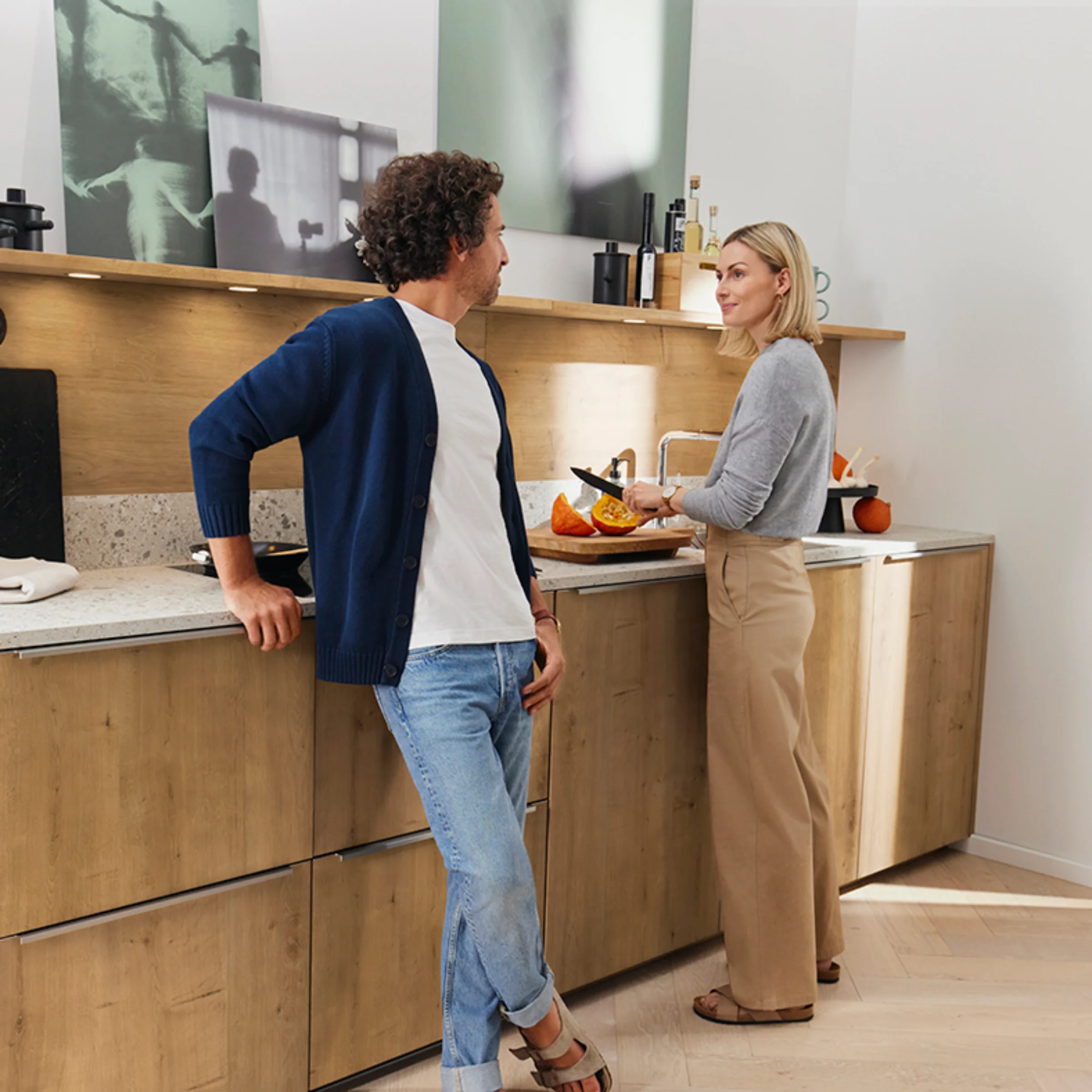
Color is inspiration, atmosphere and creativity. And offers almost infinite possibilities for individualization. In interior design, they play a decisive role in making us feel comfortable. However, we often lack the courage to use color. The fear of getting fed up is particularly great when it comes to kitchen planning. With the matt lacquer concept, Nolte Küchen has taken precautions: here you can combine your favorite colors in style without going too far! Whatever you like and expresses your personality is allowed. Our matt lacquer concept paints a harmonious picture of warm, invigorating tones and cool, calming colors.
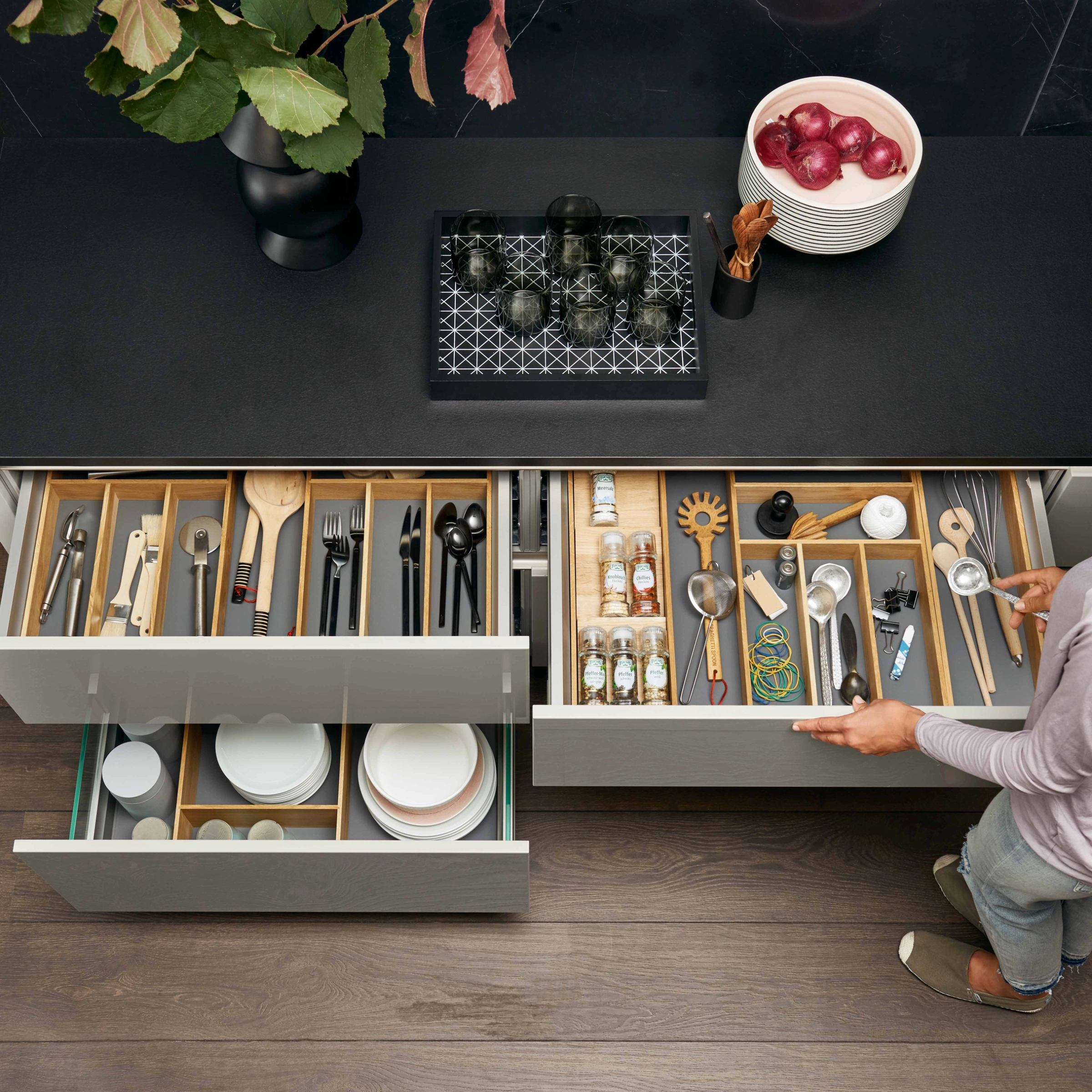
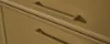
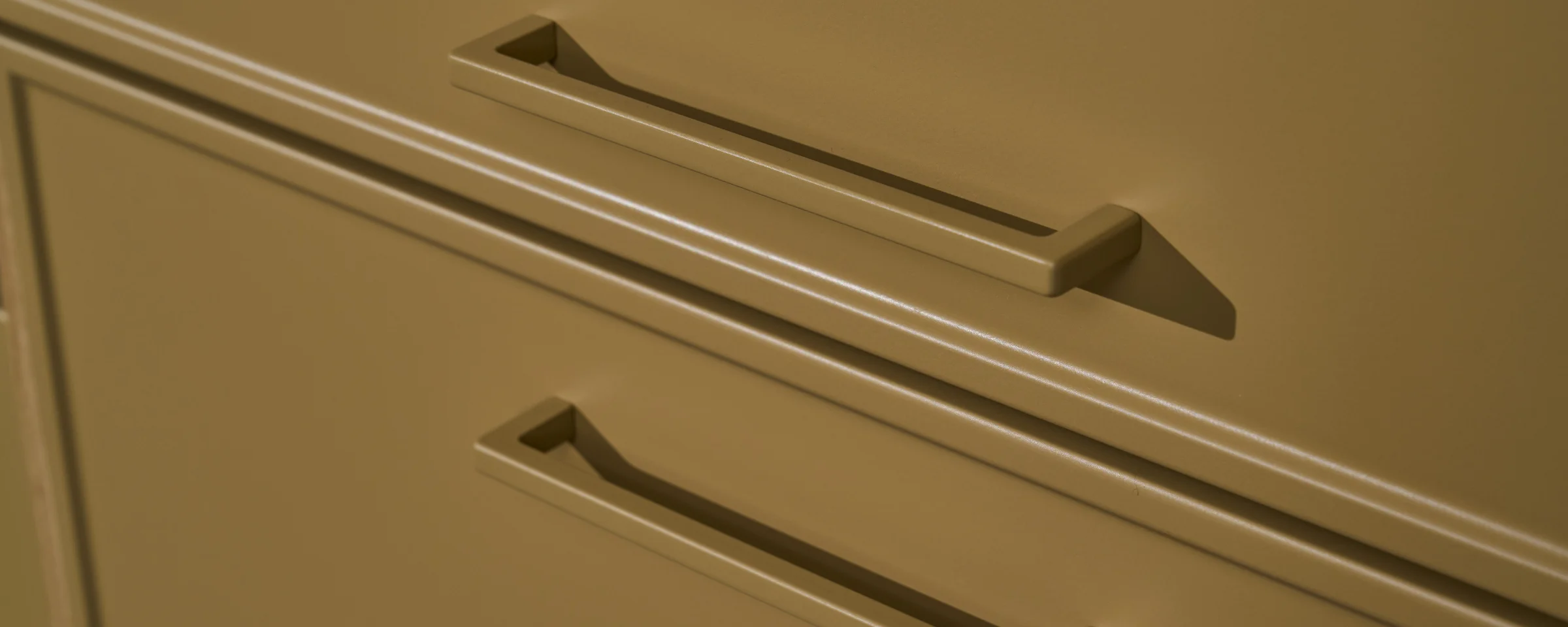
One handle.Twenty possibilities.
Perfect extension of the matt lacquer concept.
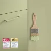
Matt lacquer for the wall
Experience the Matt Lacquer Concept from Nolte Küchen now also on your walls – with perfectly coordinated colours for a harmonious living concept from a single source.


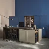
Tone-on-tone: colour reimagined
How harmonious kitchen design can be when fronts, walls and details are perfectly colour-coordinated is shown by the tone-on-tone principle. Discover how calm, modern spatial concepts can be created with the matt lacquer concept.
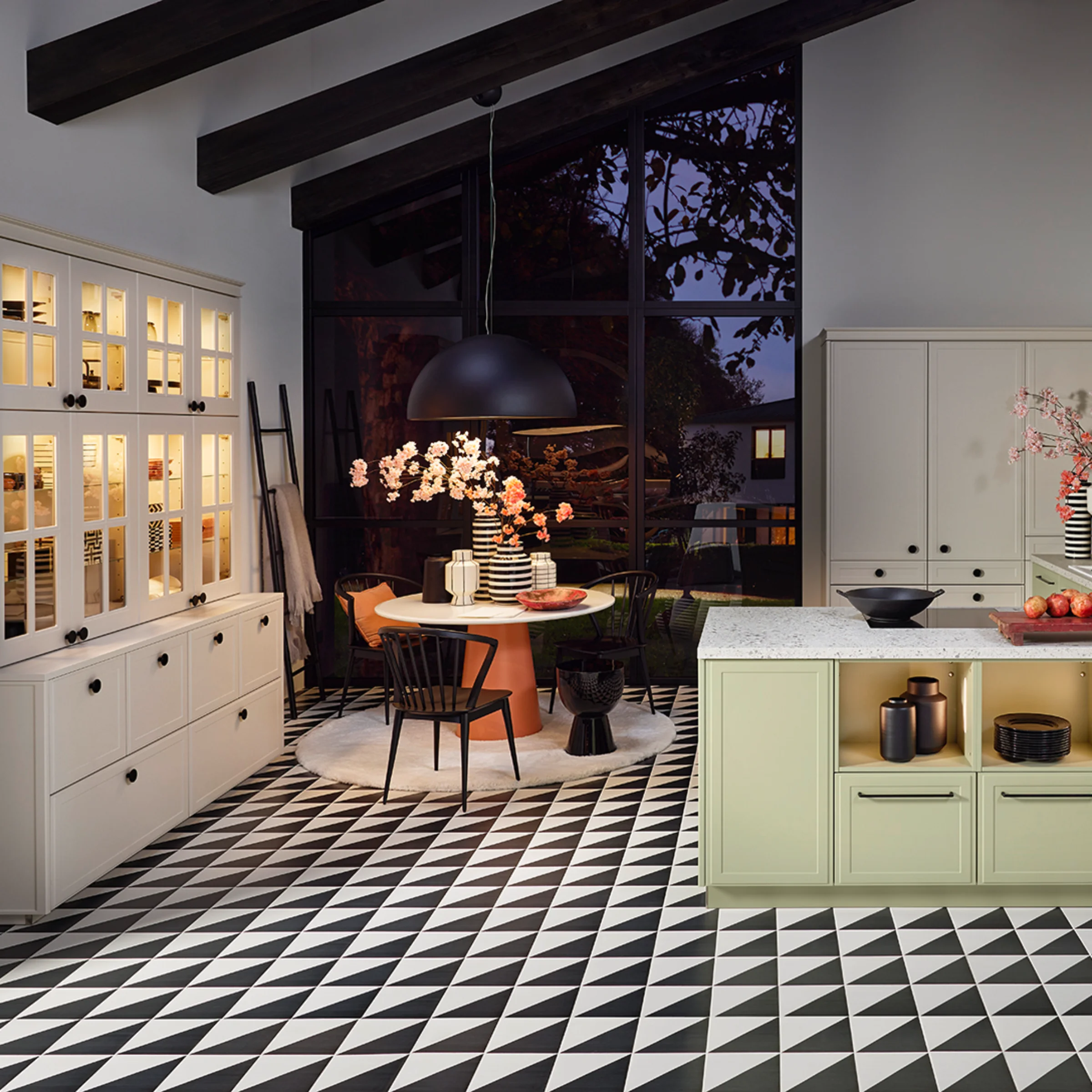
Matt lacquer colors in planning - inspiring examples
The versatility of the extended matt lacquer concept in practice is demonstrated by the new plans from the latest innovations. Each plan interprets the matt surfaces in its own way - sometimes natural and homely, sometimes purist and modern.
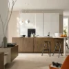
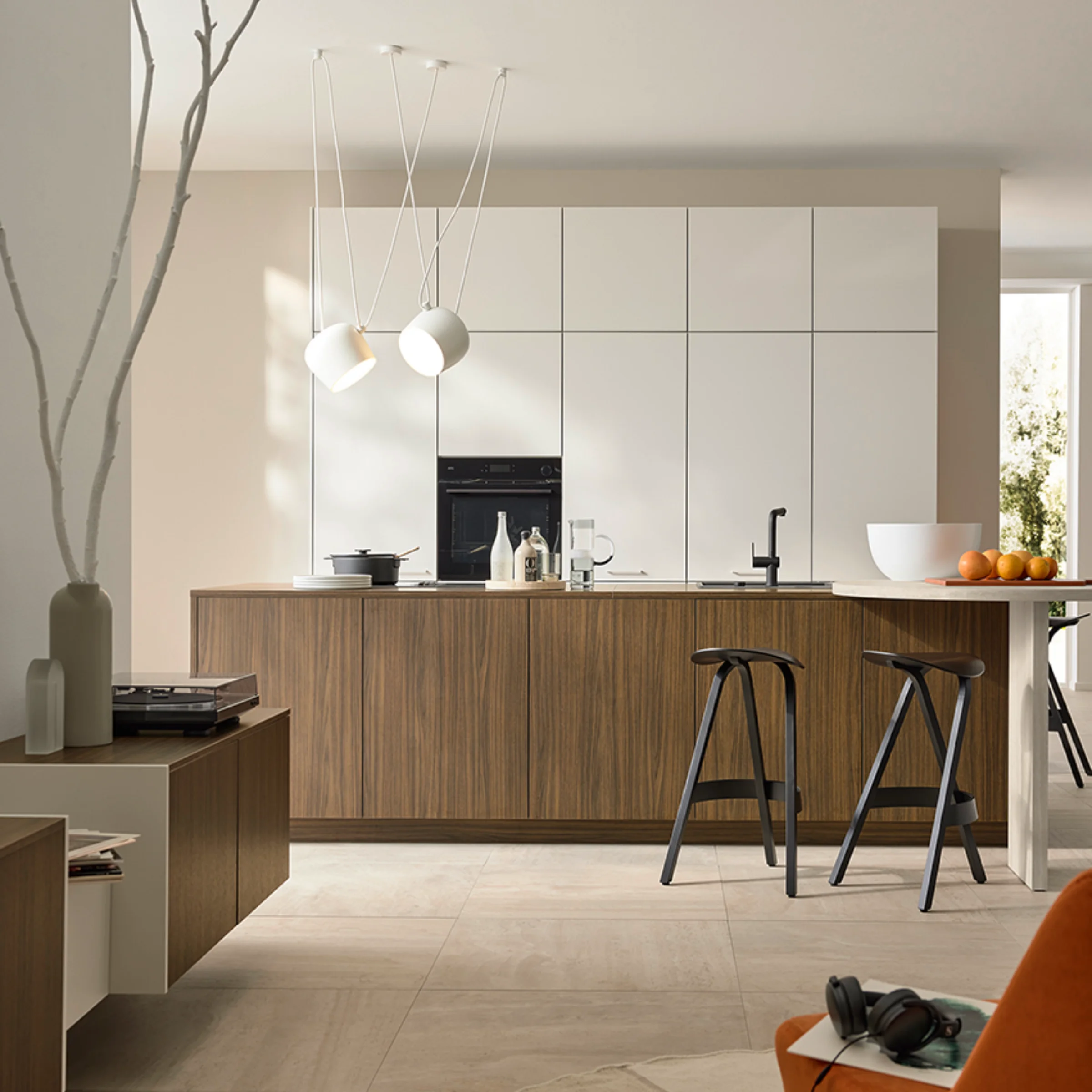
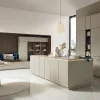
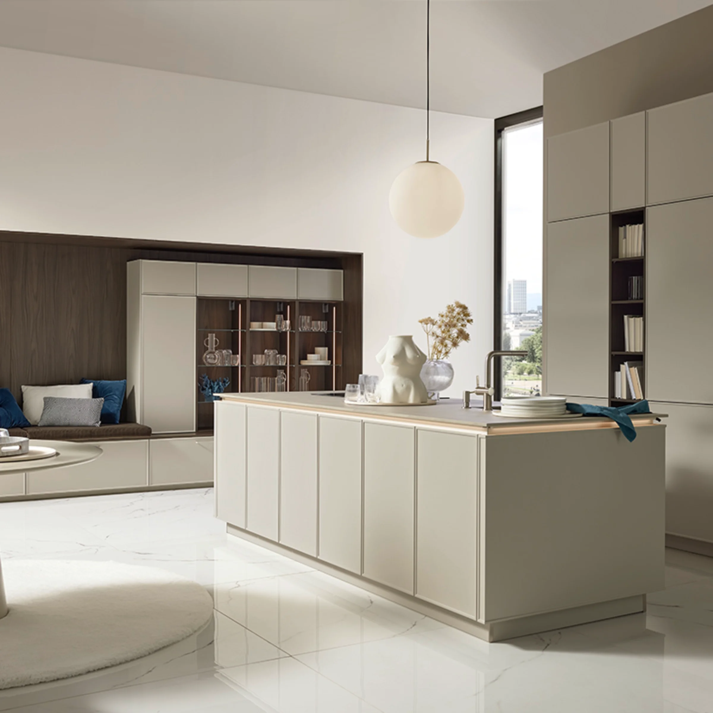
Whether soft cashmere, trendy greige or a monochrome interplay of color and texture: the new matt lacquer fronts create harmonious room worlds in which the kitchen and living area merge into a single unit.
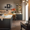
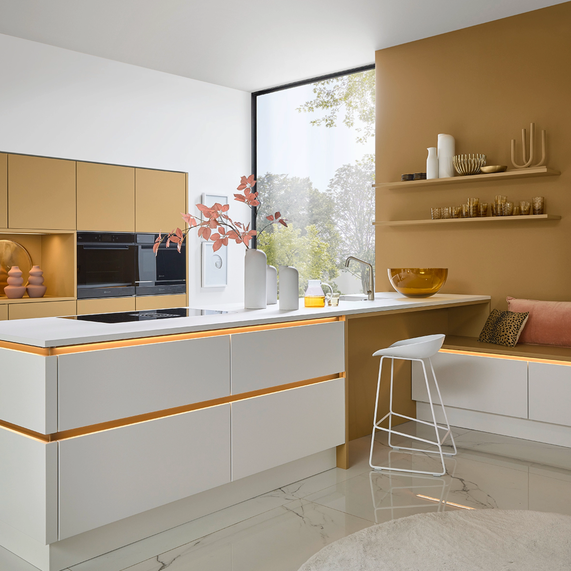
Natural Elegance in cashmere
In this design, SOFT LACK cashmere meets the warm wood decor MANHATTAN Havana walnut. The new matt lacquer tone gives the kitchen a calm, natural look and harmonizes perfectly with the grain of the wood.
Wall paint and handles pick up on the color of the fronts - the wall in the Schöner Wohnen color cashmere, the handles in cashmere and sepia brown. This creates a harmonious overall look that combines elegance and homeliness. The round counter and the black mixer set modern accents and round off the harmonious concept.
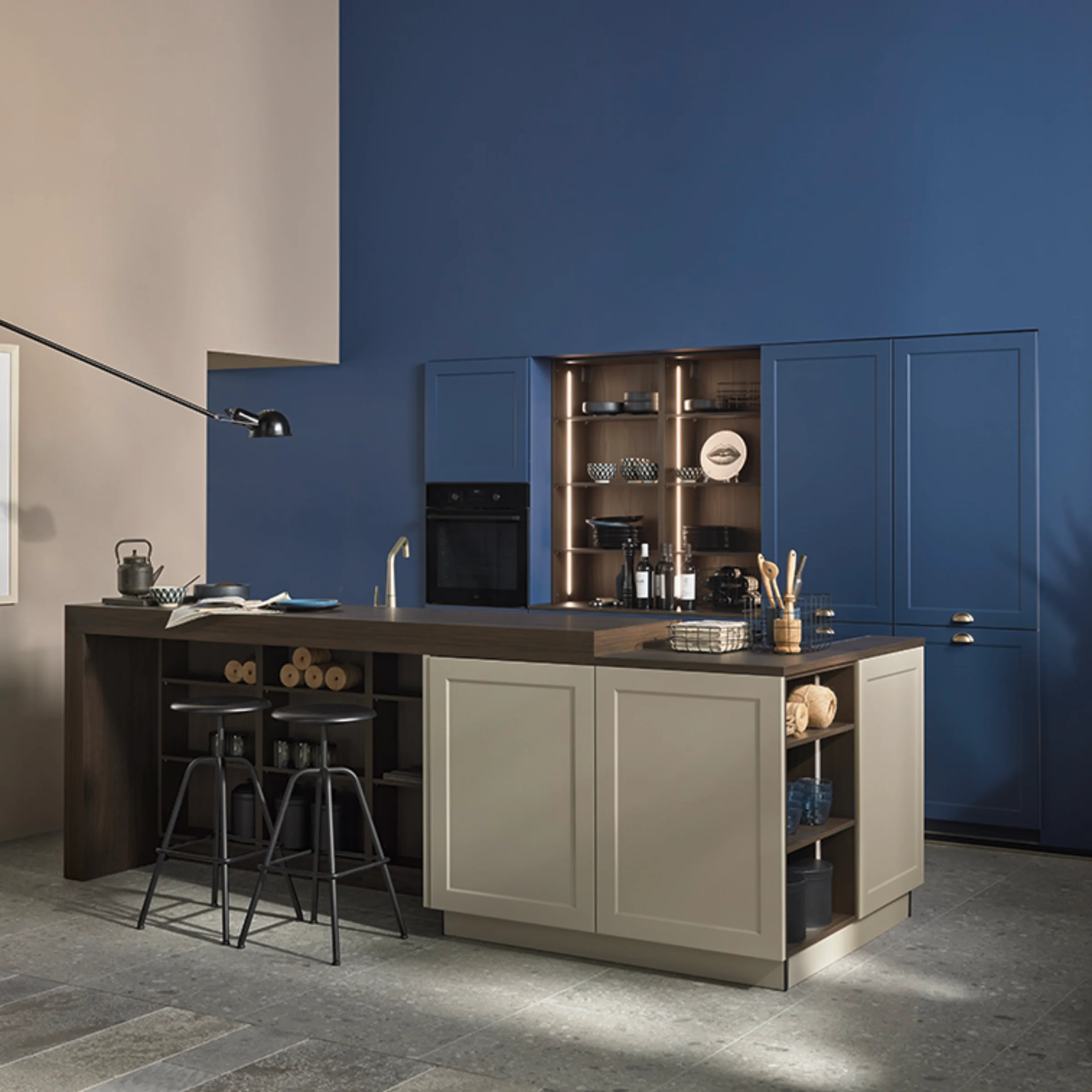
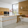
Gentle naturalness in greige
This design focuses on a clear, natural effect. The new matt lacquer shade Greige meets the likewise new EVORA LACK front, which brings modern elegance to the kitchen with its fine frame look.
Together with light wood elements, a harmonious interplay of structure and calm is created. The matt lacquer gives the surface a soft feel, while Greige, a shade between grey and beige, creates a warm, homely atmosphere - perfect for modern kitchens with a natural character.
Classical music reinterpreted
The new EVORA LACK front is shown here in its most beautiful combination: caramel meets magnolia. The interplay of warm, caramel-coloured matt lacquer and light frame front looks elegant and homely at the same time.
Handles and wall color are coordinated tone-in-tone with the fronts and pick up on the "one piece" concept. The Cremona Beige worktop with anti-fingerprint surface complements the harmonious overall look. The result is a look that reinterprets classic shapes - timeless, elegant and full of charm.
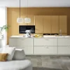

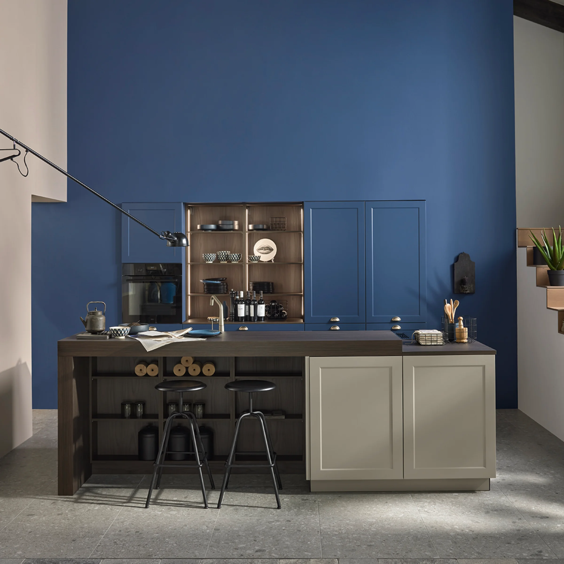
Natural and modern
The new RAVENNA LACK front in blueberry, combined with greige, is a bold use of color. The strong blue tone brings freshness and individuality to the country house style, while greige provides a calm counterpart for balance.
Fine frame profiles lend the fronts a handcrafted character, and the Noce Marone worktop emphasizes the warm, natural look of the kitchen with its wood look. The concept is complemented by handles in manganese bronze, which add an elegant finishing touch to the color contrast. The result is a modern country house look that combines classic elements with a bold color scheme.
Exclusive choice of materials
This LUGANO LACK in soft matt black features a high-quality mix of materials: Wood, glass, ceramic and metal create a very high-quality overall impression. For even more flexibility, you can now also plan the country house kitchen without handles, as in this example.

Elegant combination
This is where the matt lacquer concept shows its chocolate side: In this SOFT LACK, caramel and white soft matt shine as a harmonious duo. The caramel-colored fronts create a seamless connection to the illuminated handle tracks in manganese bronze.
More information
In our My kitchen brochure, you’ll discover a wide range of inspiration, smart planning ideas, and innovative solutions for a kitchen that perfectly fits your life.

Discover tips and tricks
Discover many more tips and tricks in the Nolte magazine.